For the Love of Beverages
Recent labels, logos, and other design work for some of my favorite beverages. I’d love to do more, so if you’re a brewery, winery, distillery, or a lover of any of those that need labels, merch, or other marketing materials designed, let’s talk.
Grab yourself something to sip and enjoy the scroll …
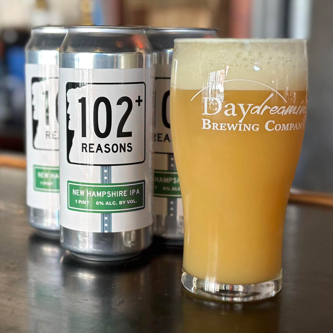
102+ Reasons Beer Label Design
When one of my friends said he was guest brewing one of his beers at Daydreaming Brewing Company and needed a cool label for the cans, I jumped on board! The beer takes its name from the route number for the location of the brewery and also because it was the last stop (number 102) on a local brewery trail the year it was brewed. The “+” is for all the other reasons for brewing a crushable and delicious beer!

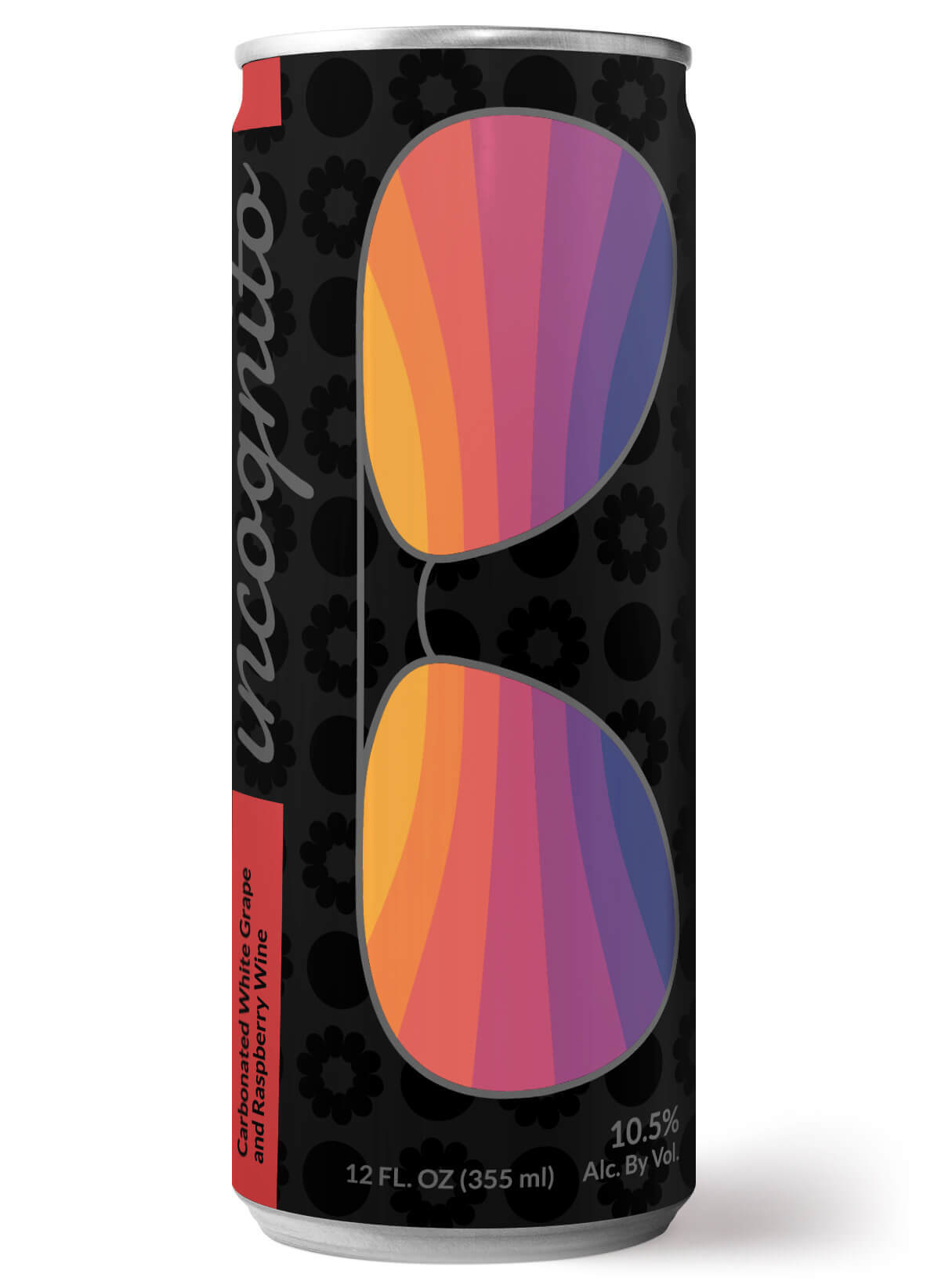
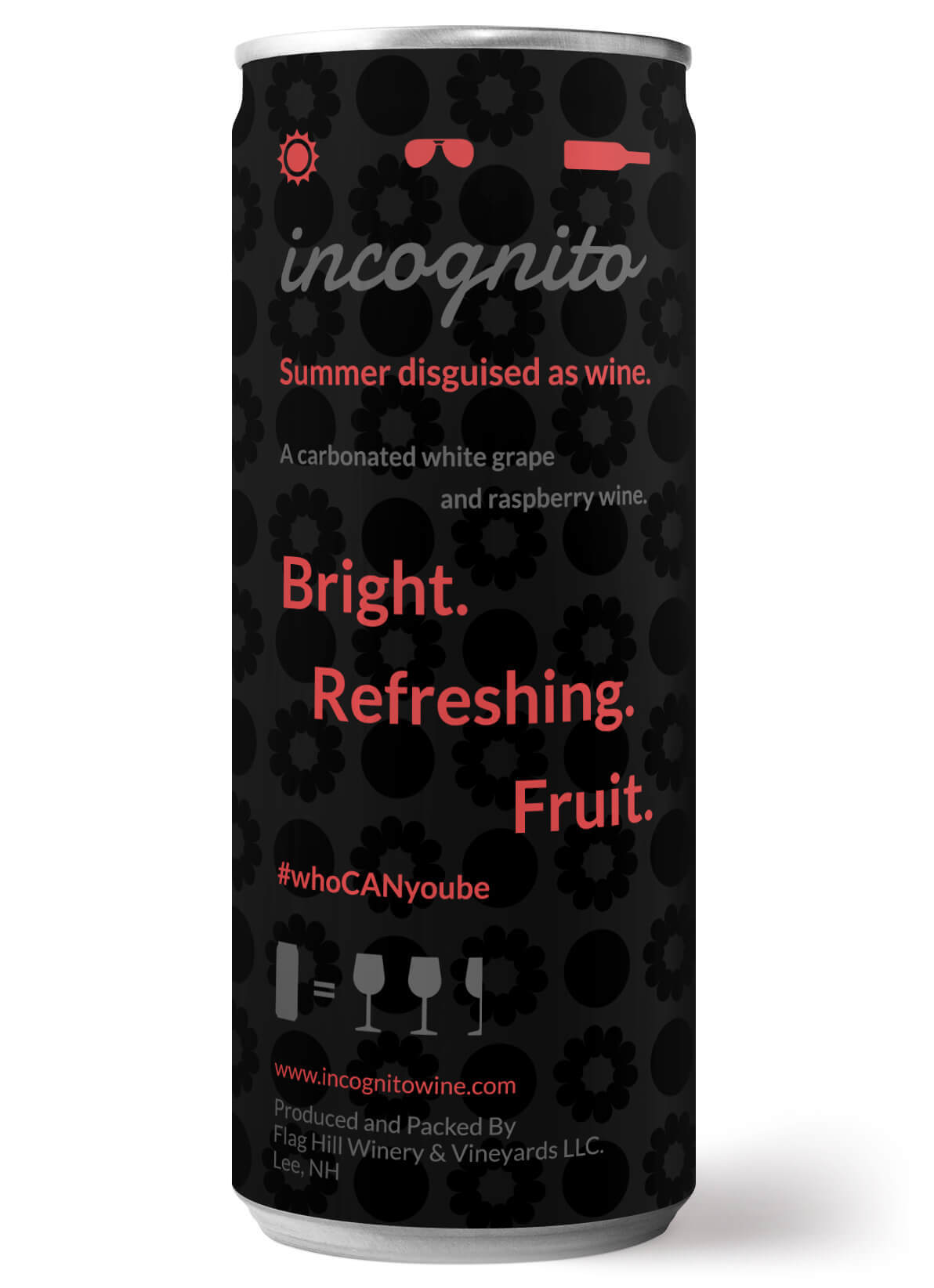
Canned Wine Label Design
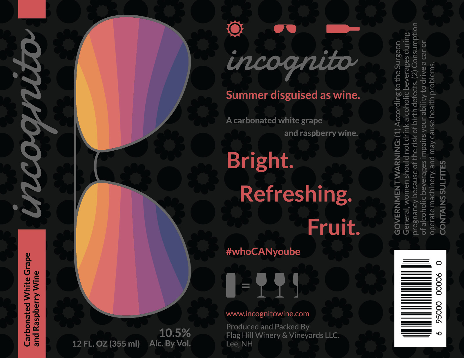
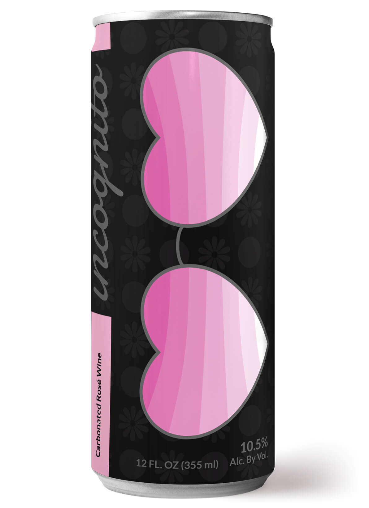
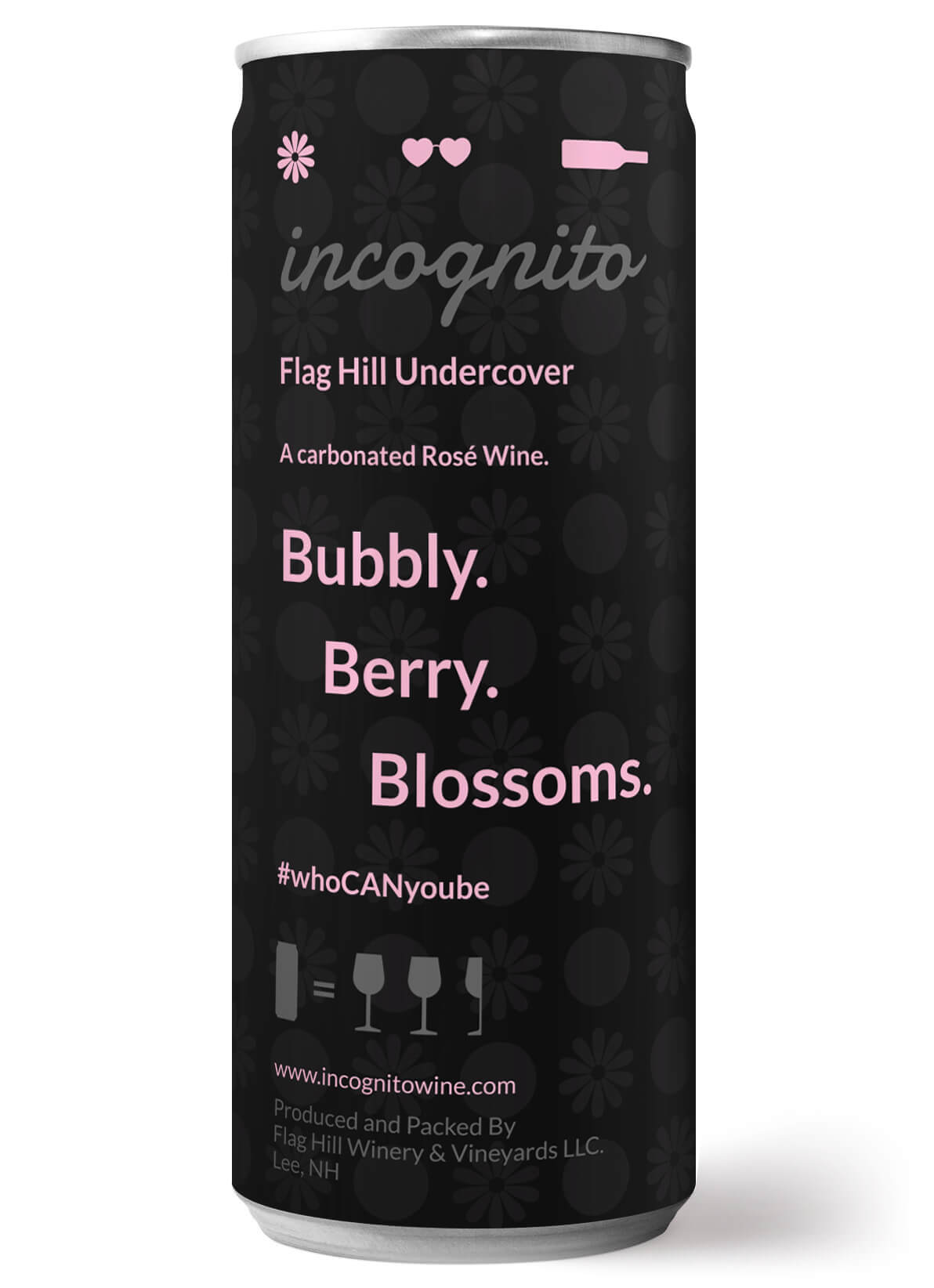
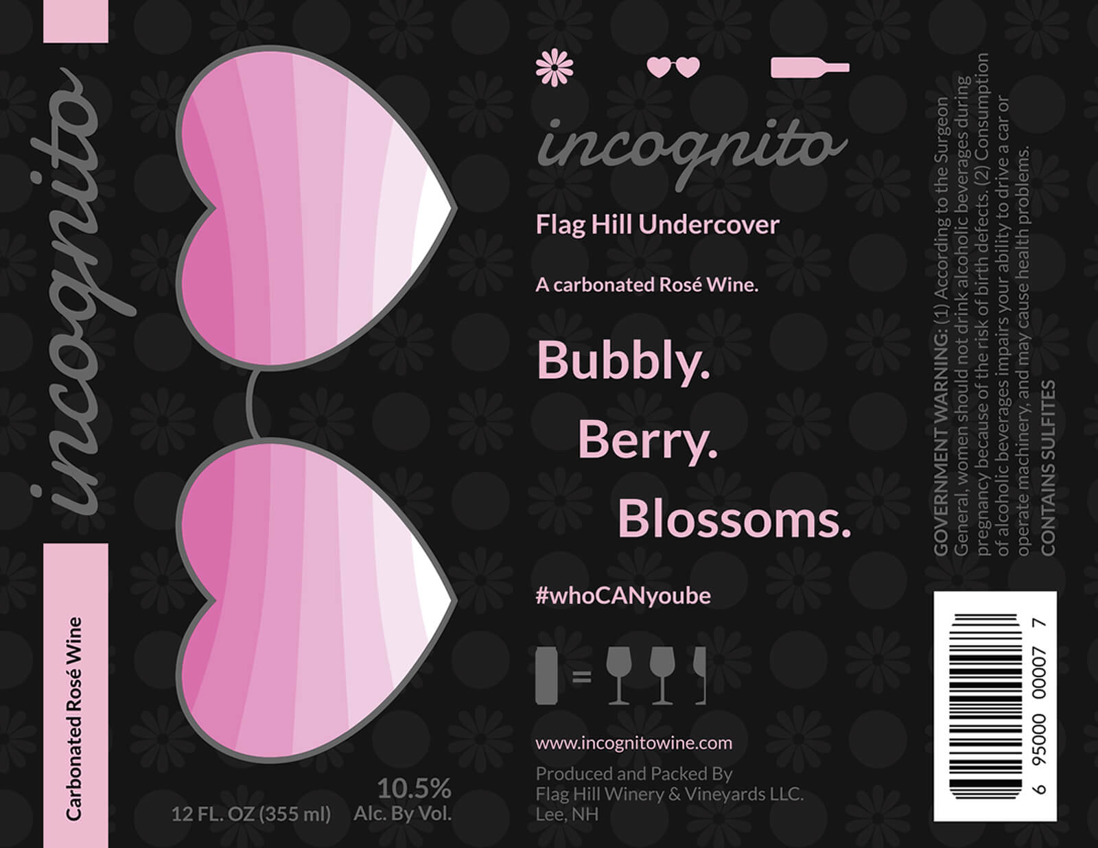
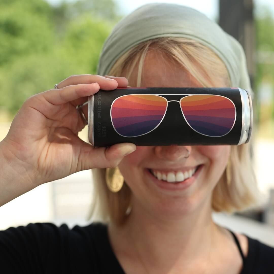
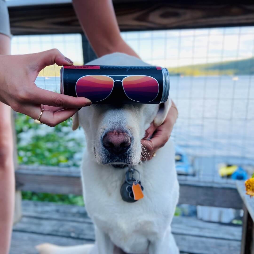
Flag Hill Distillery and Winery reached out because they were canning some new sparkling wines and wanted a set of unique labels. The Incognito series of canned wines, though produced by Flag Hill, is meant to stand on its own as a unique brand. Sunglasses (a summer essential, as well as a way to stay a bit “incognito” when out and about) are the main attention grabber here as they reflect bold colors.
The rims of the sunglasses are transparent (nothing printed on the label), so the silver of the can shows through for an added visual punch. The pops of red and subtle raspberry and grape background texture for summer, and shades of pink with subtle flower and grape background texture for spring on the labels also indicate the wine’s flavor. The UPC barcode is in the shape of a can for an extra bit of fun.
Here are some images from a social media campaign Flag Hill created showing people having fun with the cans. This really shows off the concept of the design.

Stoneface Brewing Can Designs
I wasn’t actually asked to re-design the Stoneface Brewing Co. cans, and I would never try to improve on another designer’s work without being hired to do it but … while researching beer can branding (delicious, refreshing research), I couldn’t help taking a stab at re-organizing how all the important information was displayed. I incorporated minimalism and pattern – 2 of my favorite design techniques.
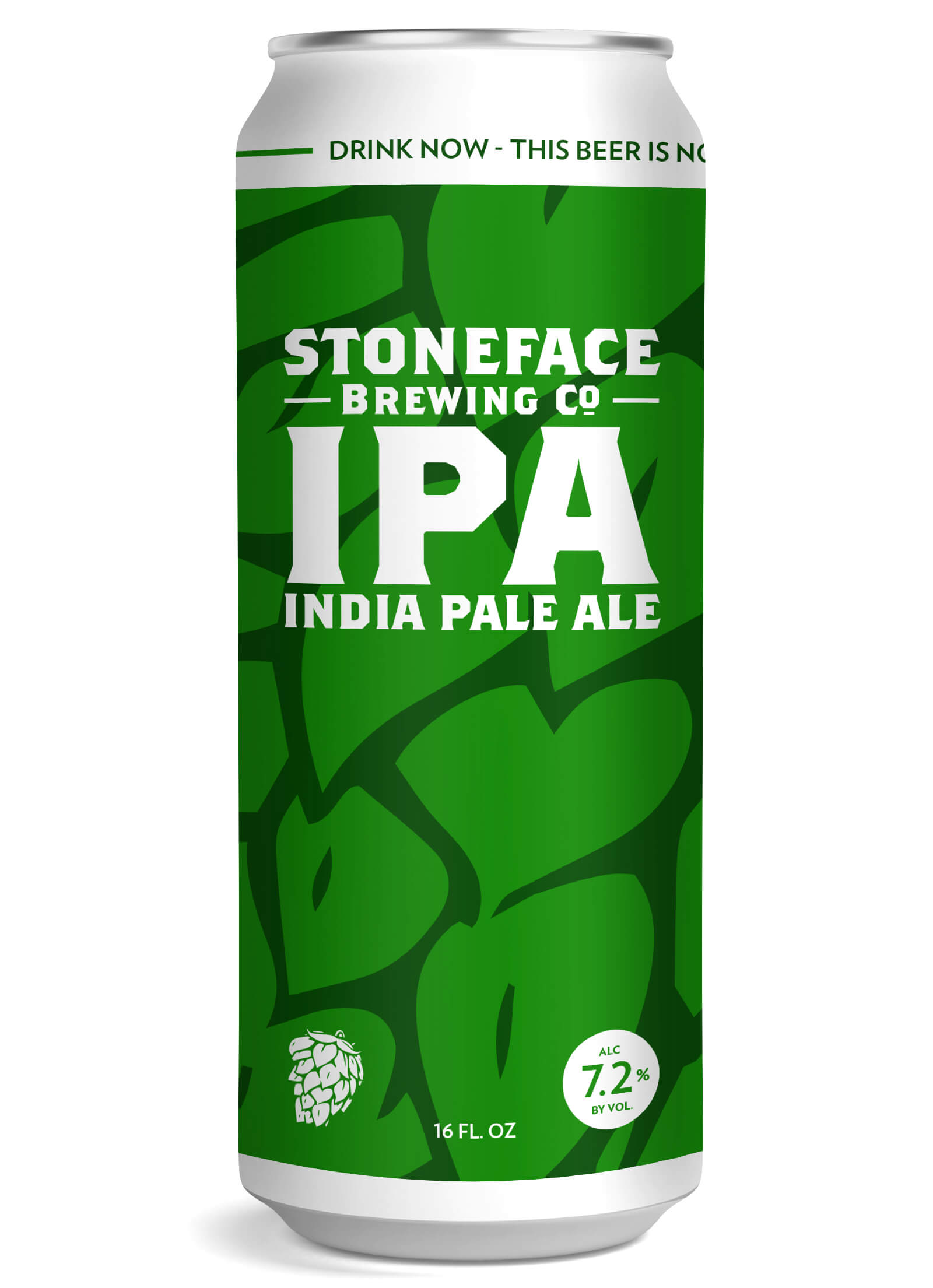
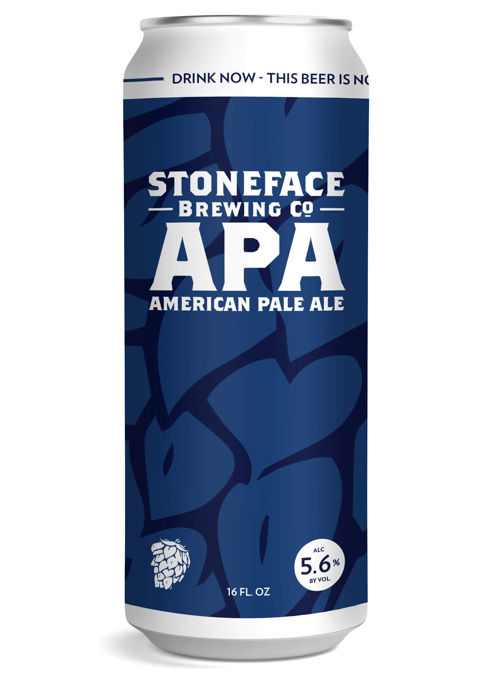
The brewery name, type of beer, and ABV are a bit more prominent so they’re more noticeable and easier to read from a distance – a huge deal when you’re trying to get quickly noticed on a packed shelf with other delicious beverages. Other interesting, but less important information, along with a brief description of the beer would fit nicely on the back of the can.
In this case, the IPA can is predominately green, while the APA is blue, making them instantly recognizable at a glance. This design idea is easily expandable and much like their existing branding, each of Stoneface’s other beers could have a unique color of its own.
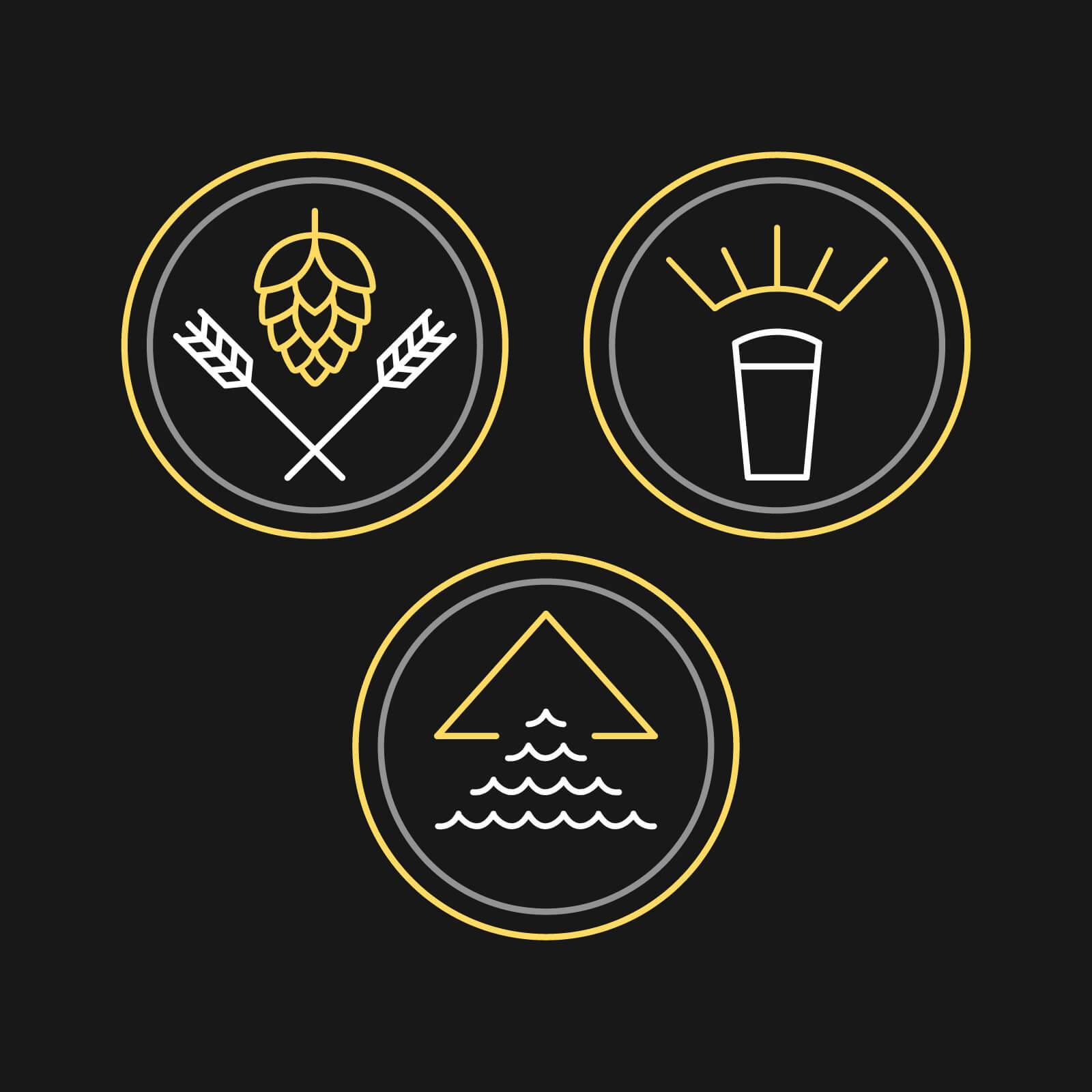
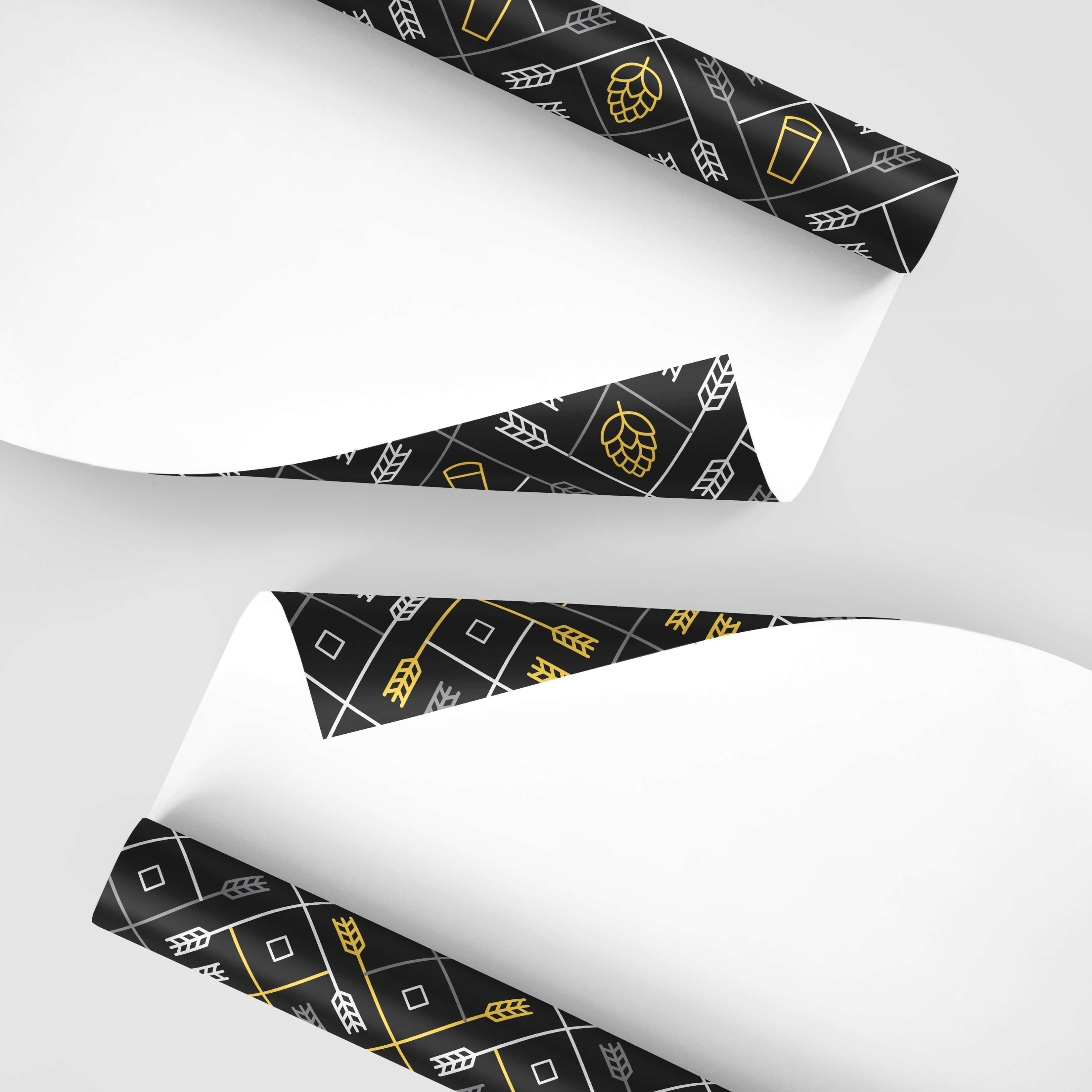
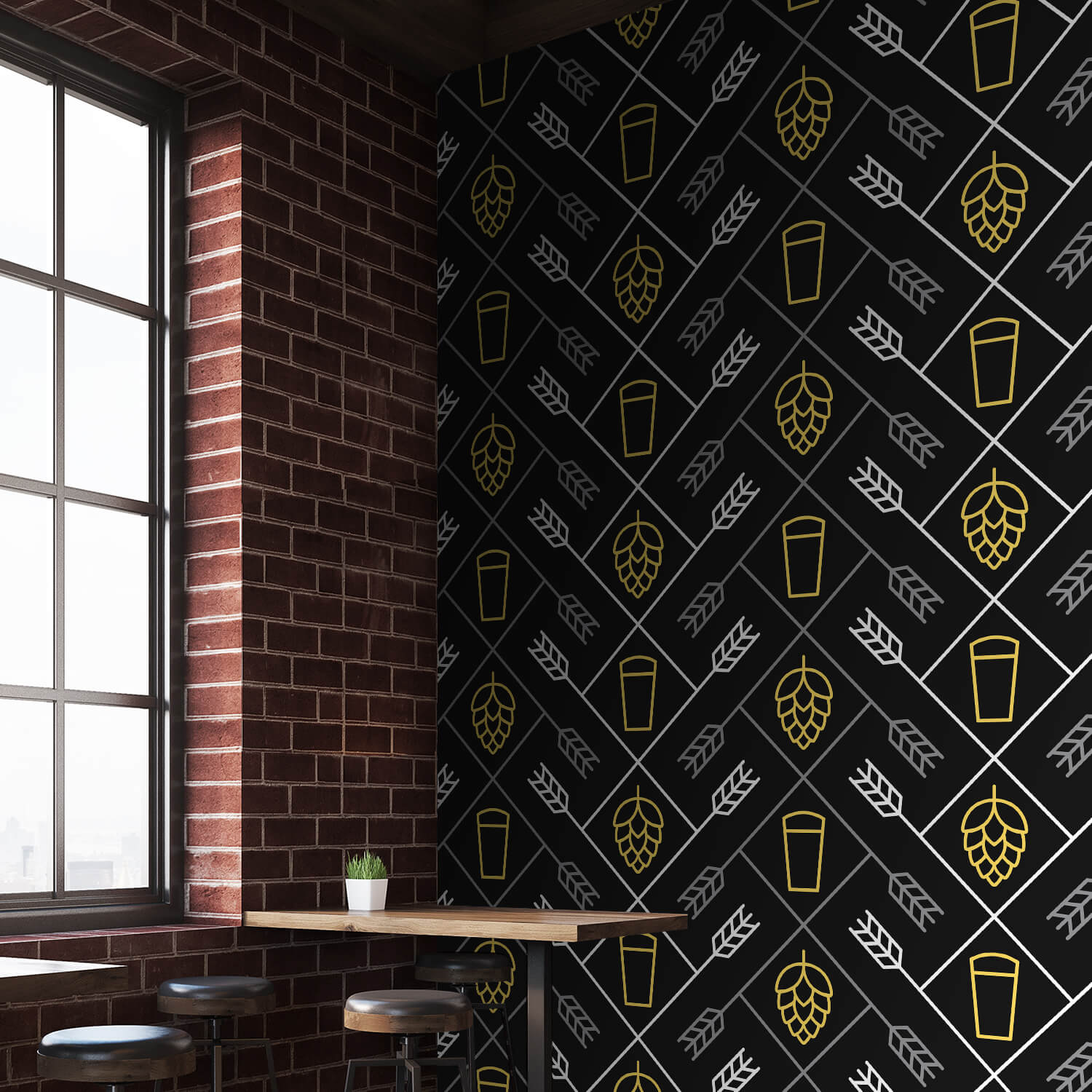
Beer Symbols
I had so much fun creating this banner and badge set to celebrate some of my favorite beverage ingredients! The icons started as an extension of a really simple set I created for another project – the rest of this evolved as I started designing around those icons.
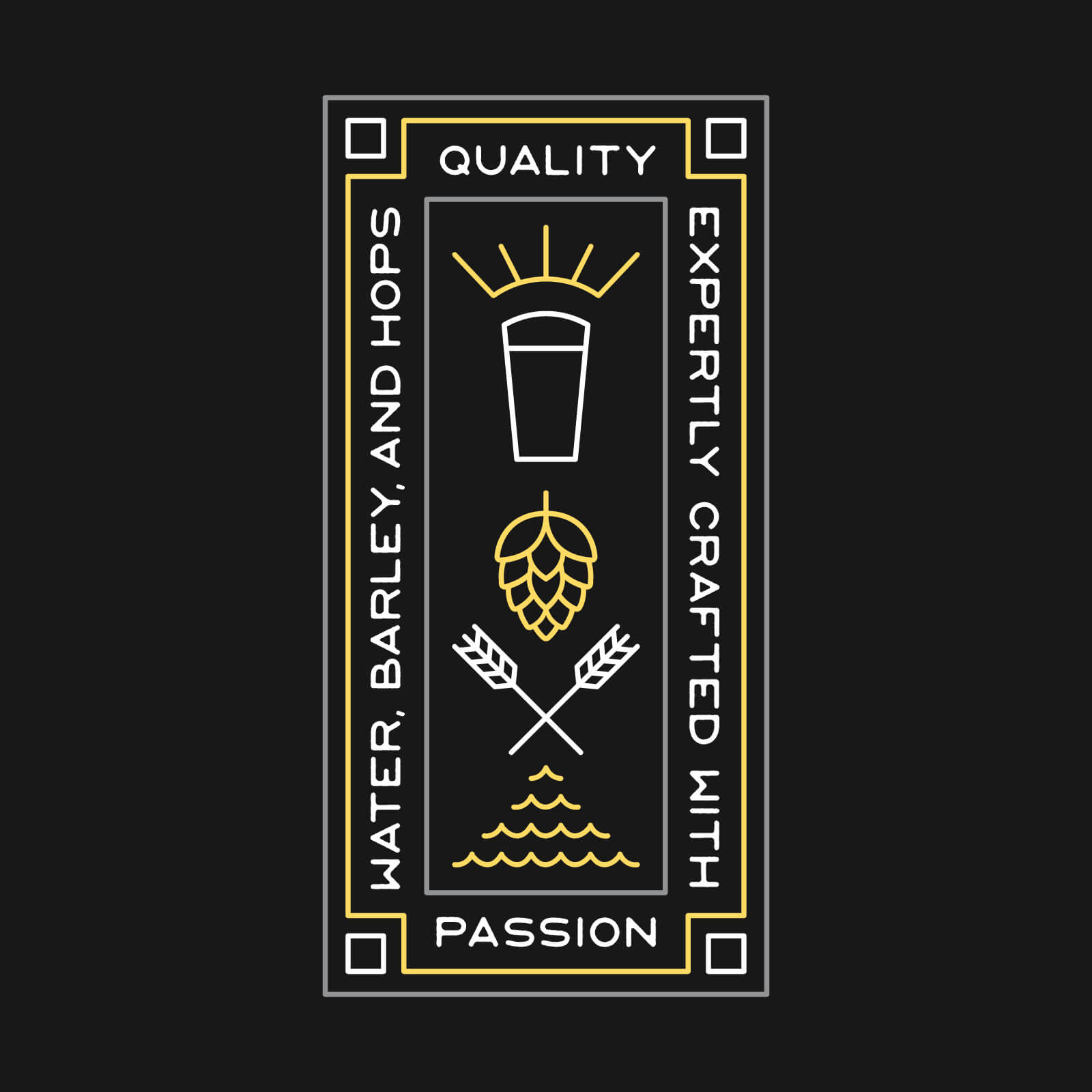
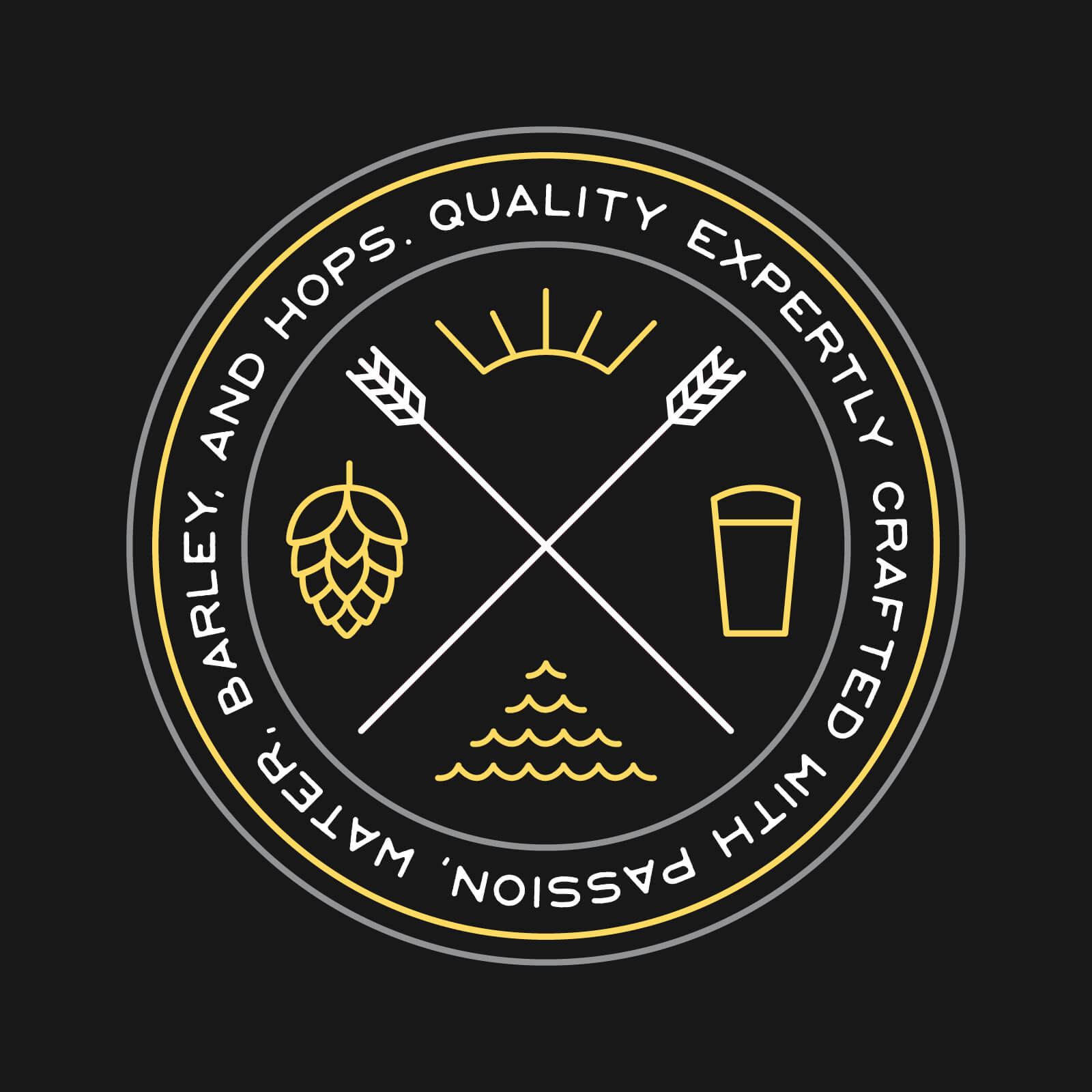
I can definitely see this in metallic inks … and maybe a couple coins!
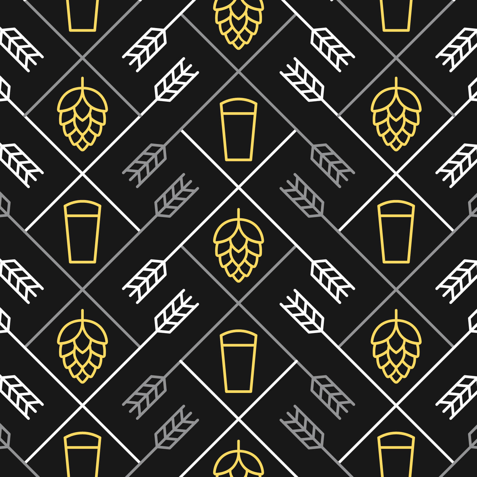
Custom wrapping paper and THAT’S a wall! A friend mentioned the pattern would look great on a wall (mural or wallpaper). I agree! I also tweaked the pattern slightly to make sure everything lined up better and the white/gray barley alternated.
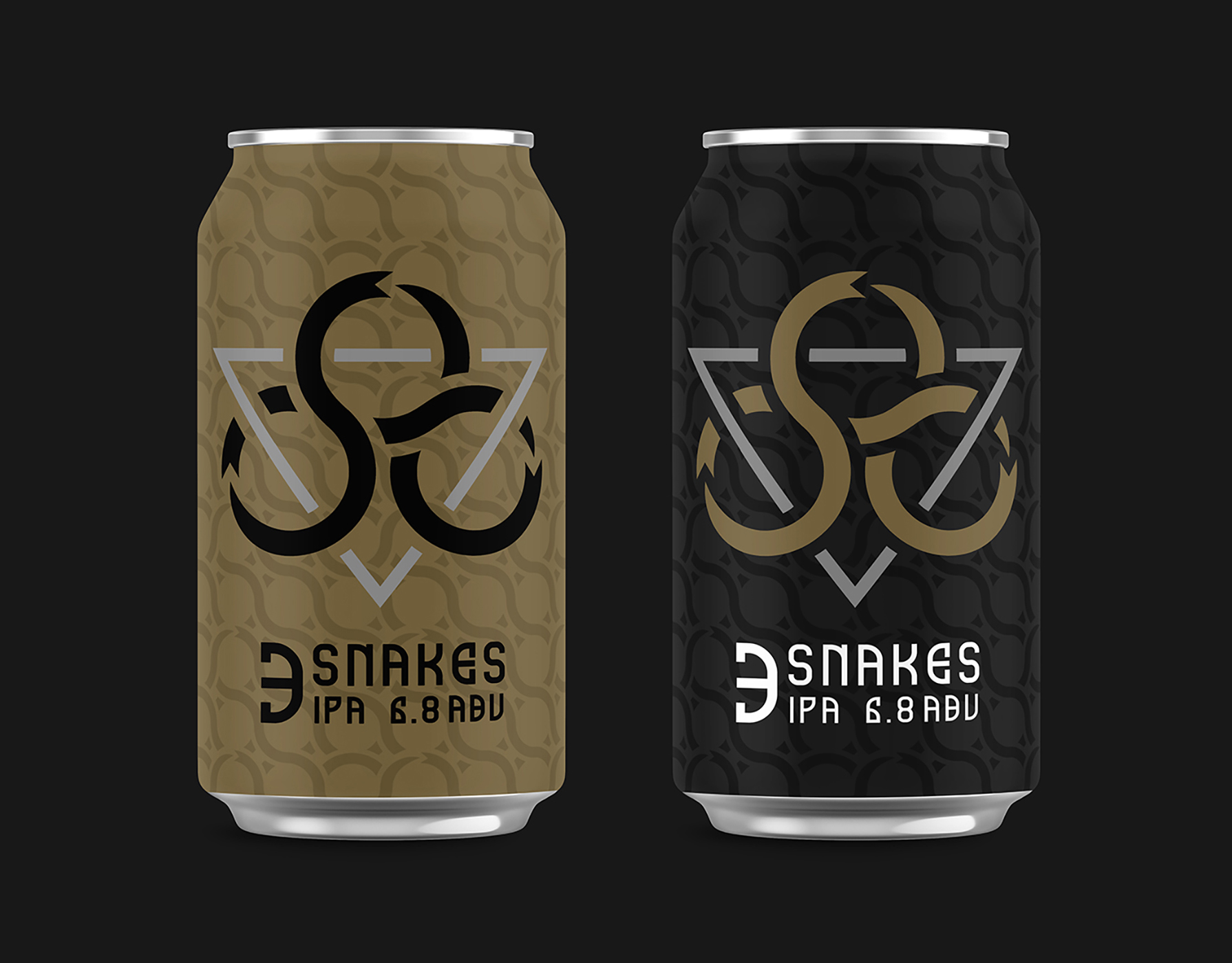
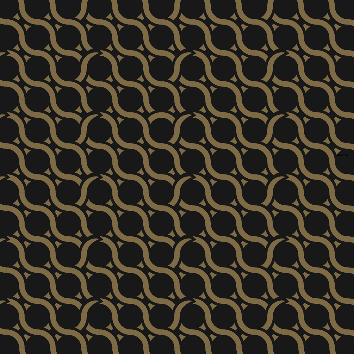
3 Snakes Logo and Can Concept
This cool ouroboros-inspired snake logo started as a single snake, but quickly evolved into 3 and some interesting patterns that work really well as a background on a can. The original logo itself also works really well on a hat!

![]()
![]()
Hop-Bomb
I’m sure this visual mashup has been done before, but here’s my concept (including alliteration) for a series of beer logos/labels … and definitely embroidered patches – definitely diggin’ the military feel of the colors.
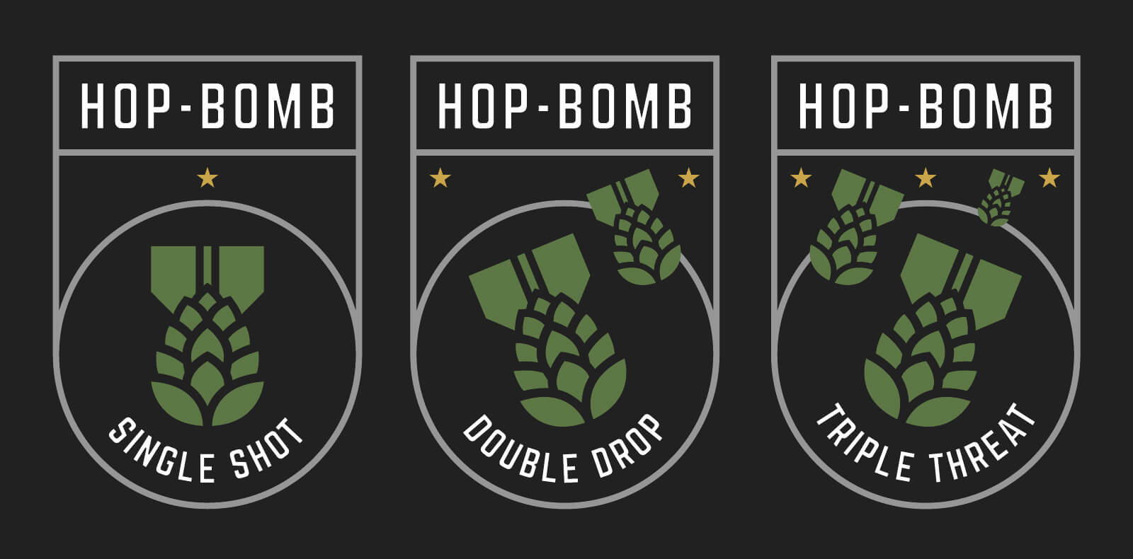
Next, I expanded the hop-bomb mark into a repeatable pattern.
![]()
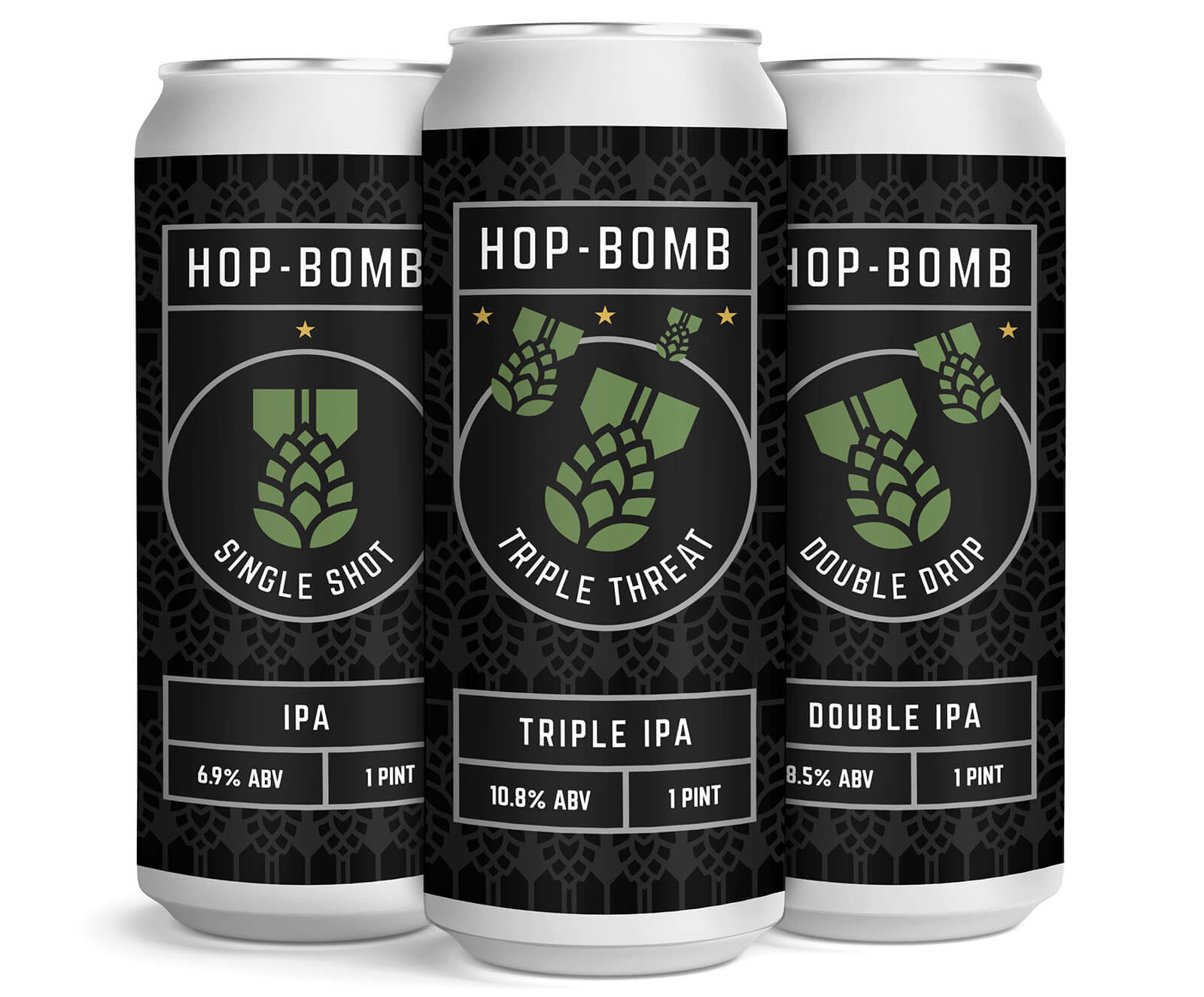
Pushing the Hop-Bomb concept a bit farther, I added it to cans. The pattern on the darker cans is super subtle, but I think that’s a good thing. It would be interesting to play with some matte vs gloss inks too (if that’s even possible for a can label). Anyway, obviously the can backs need to be designed to make this real(er), but this is great practice and a whole lot of fun!
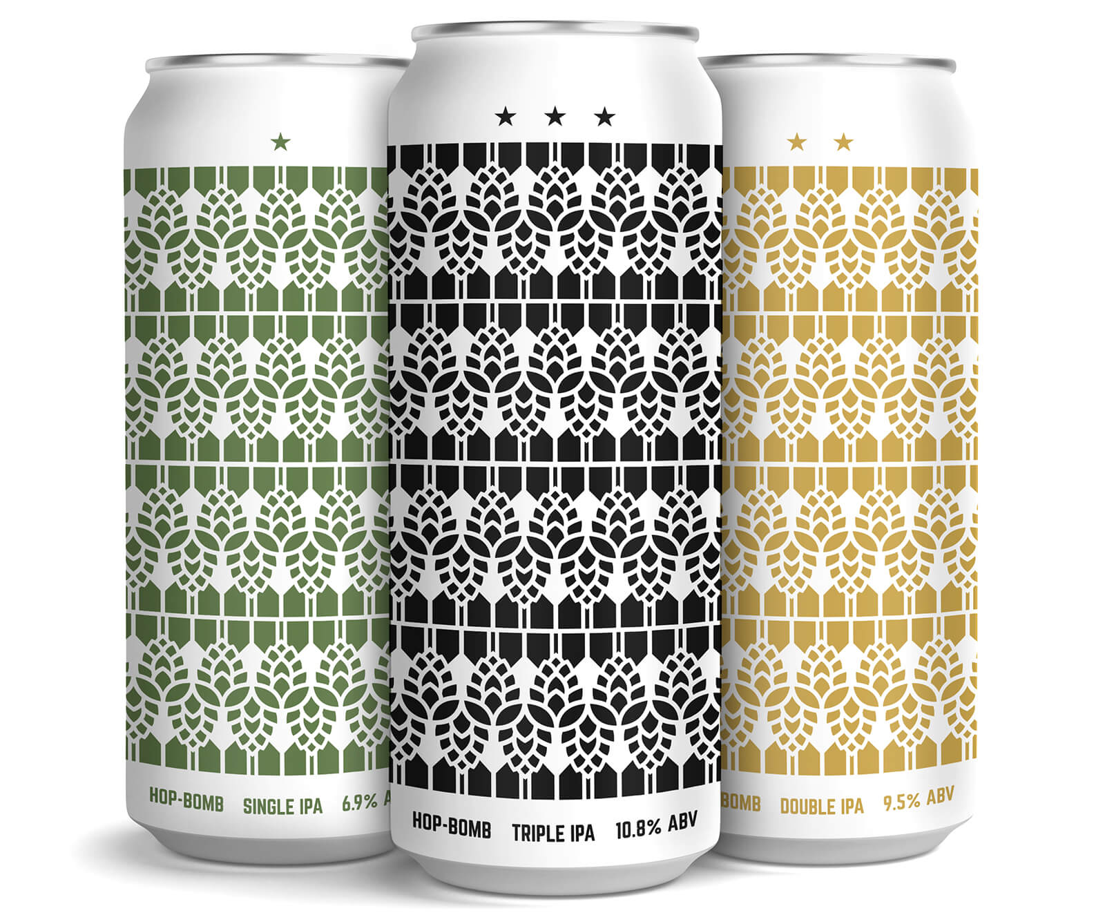
The second set of cans pushes that sweet hop pattern a lot farther (maybe too far lol). Super simple concept – a different color for each can type makes each easily recognizable. Subtle label text/info (including stars from previous badges) is limited to what is absolutely necessary.
Canning Affiliate Network Logos
A lot of smaller breweries don’t have their own canning lines. So when it’s time to can their delicious brews they turn to external canning companies that will come to their location and can for a day or so. That got me thinking. As the number of these independent canning companies grows, could they band together into an association (like the brewers association) to make what they do even better? Based on that thought process, I got to work and created a few logo and badge lockups for a fictional canning association.
![]()
![]()
As a sometimes copywriter, I’m really proud of the tagline here. It certainly speaks to the mission of providing mobile, rentable, canning services to breweries that can’t afford or maybe just aren’t ready to invest in their own canning line. What a really cool service.
![]()
![]()
Maybe these companies have already banded together. Or maybe they don’t want to. Maybe they’re happier as kick-ass indie outfits marking their territory one can at a time. That’s alright, I still think this is a great logo and fun little mark – and I love that it says “CAN” on the can! Overkill? Probably. Confusing? Possibly. An annoyingly fun pun? Absolutely.
![]()
![]()
If any canning companies out there want to use this logo (or a form of it since I’ll probably need to tweak it a bit), or breweries want to talk about branding or other design work, let’s talk!
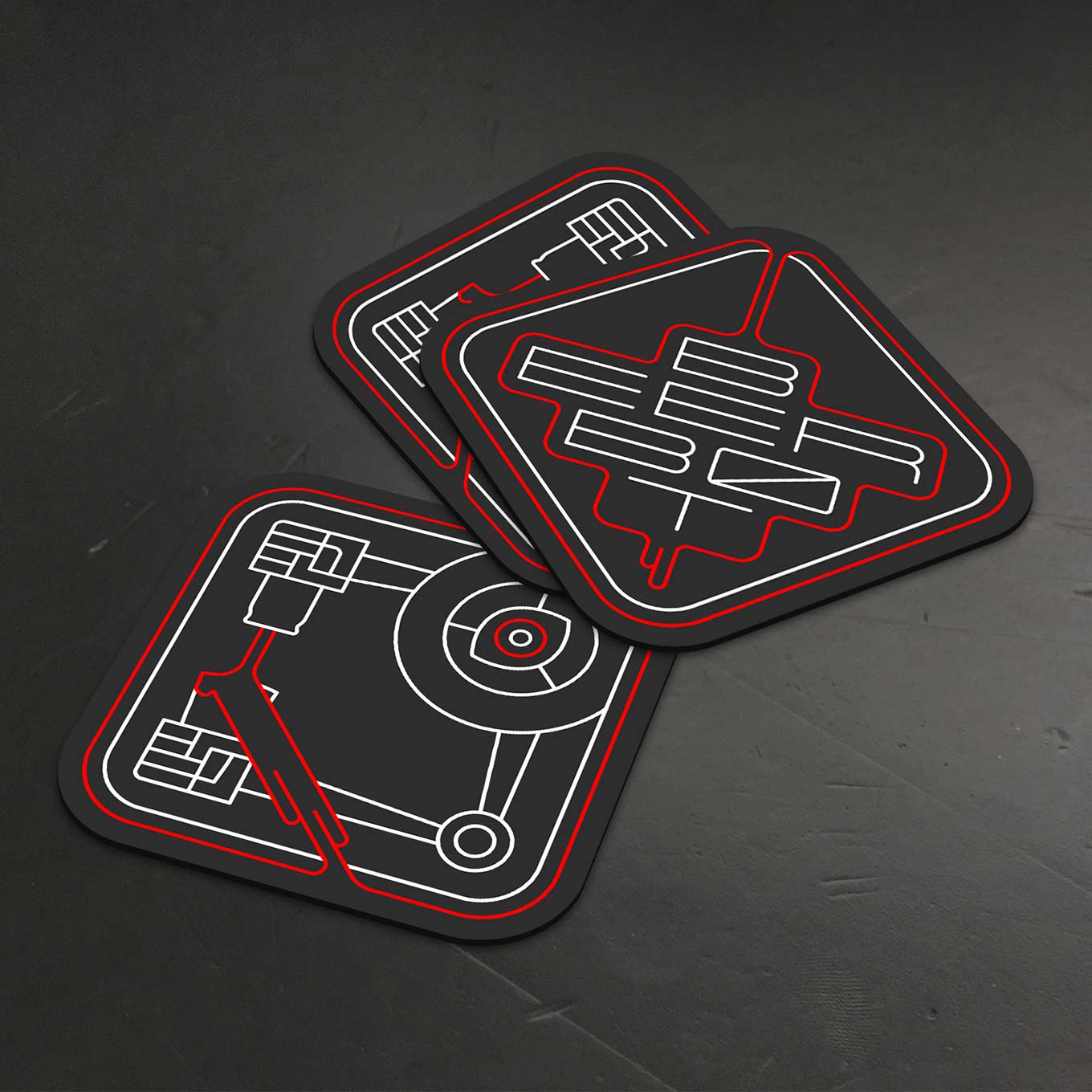
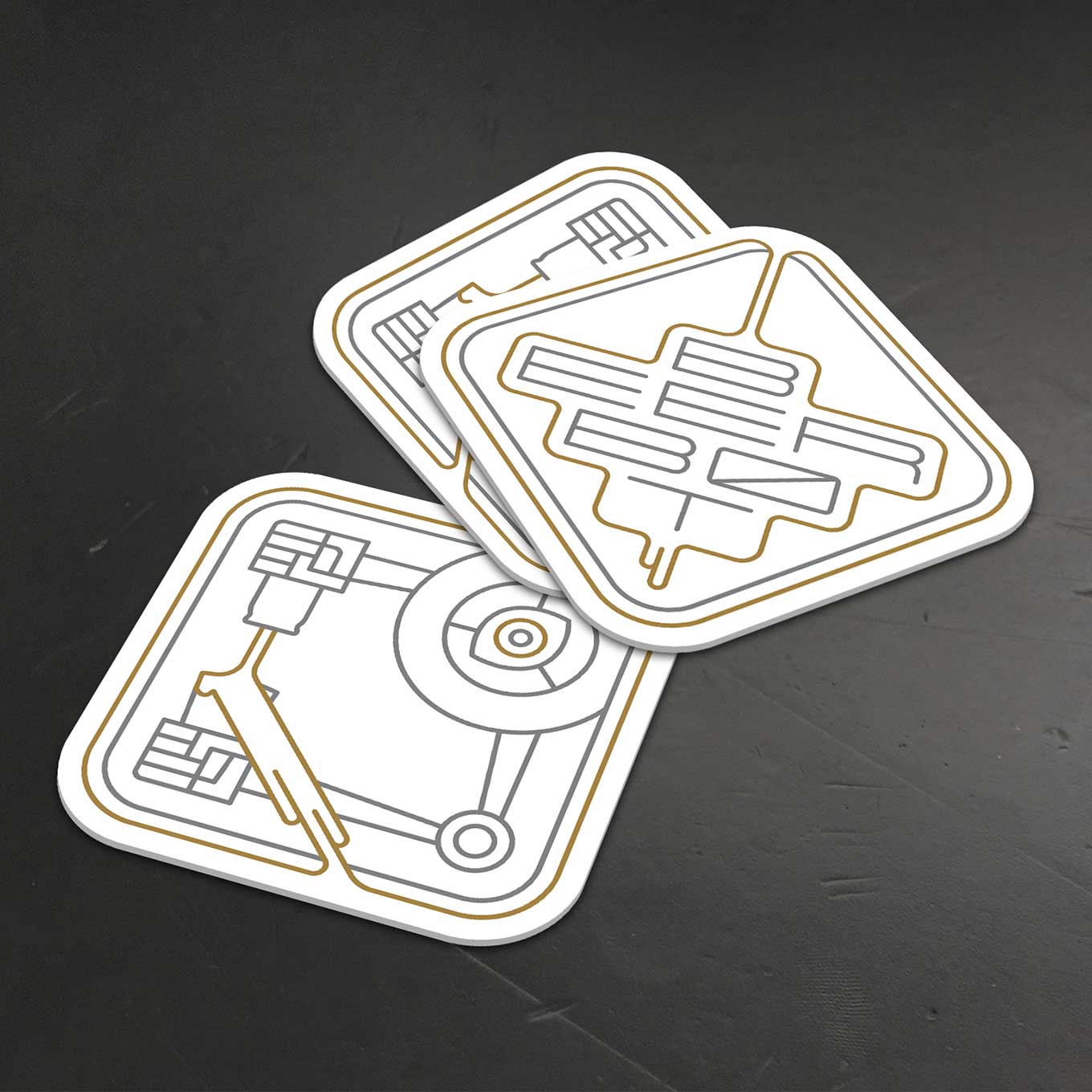
Beer Bot
Robots are awful at pouring beer. A cool logo that could look mighty fine expanded into a can label of some sort.
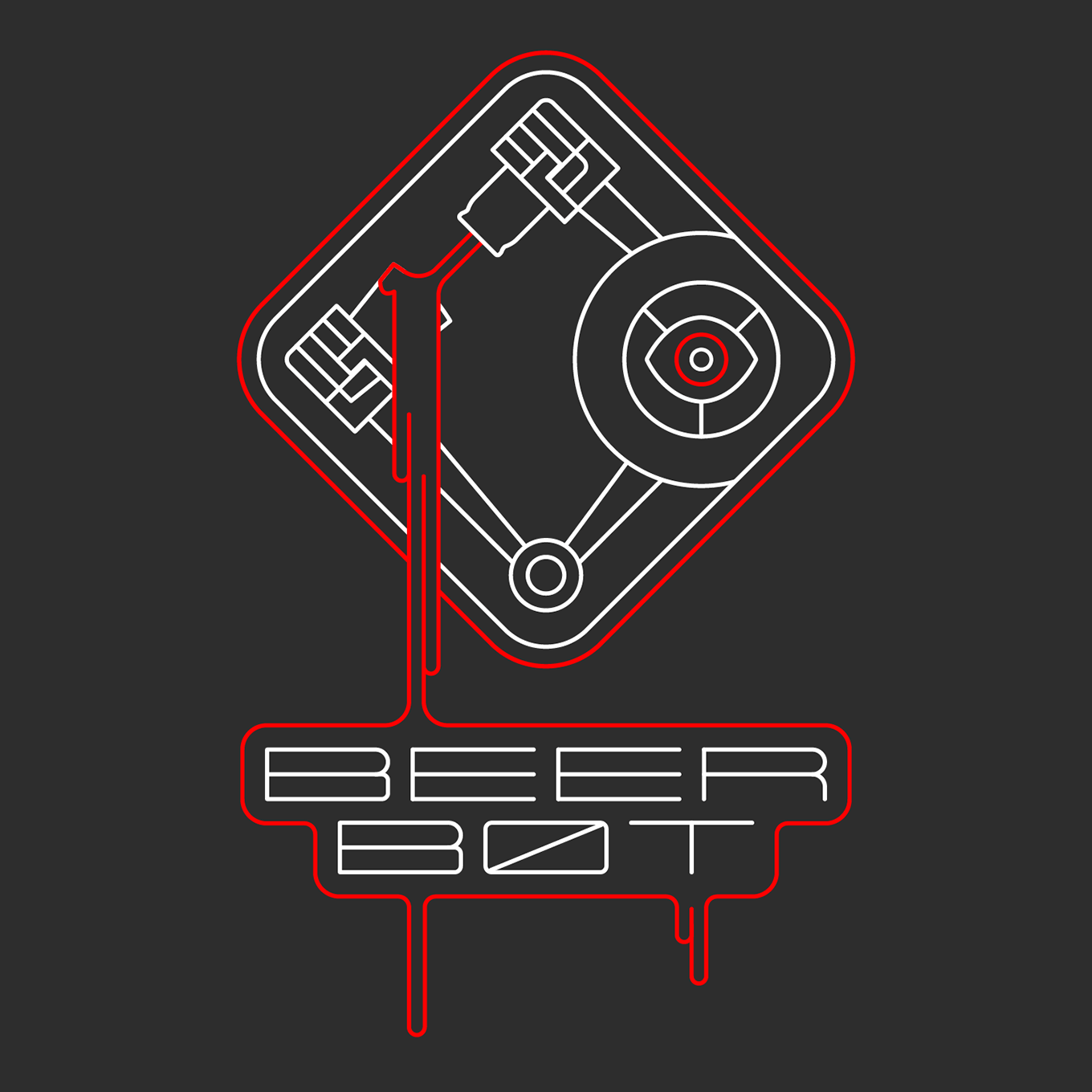
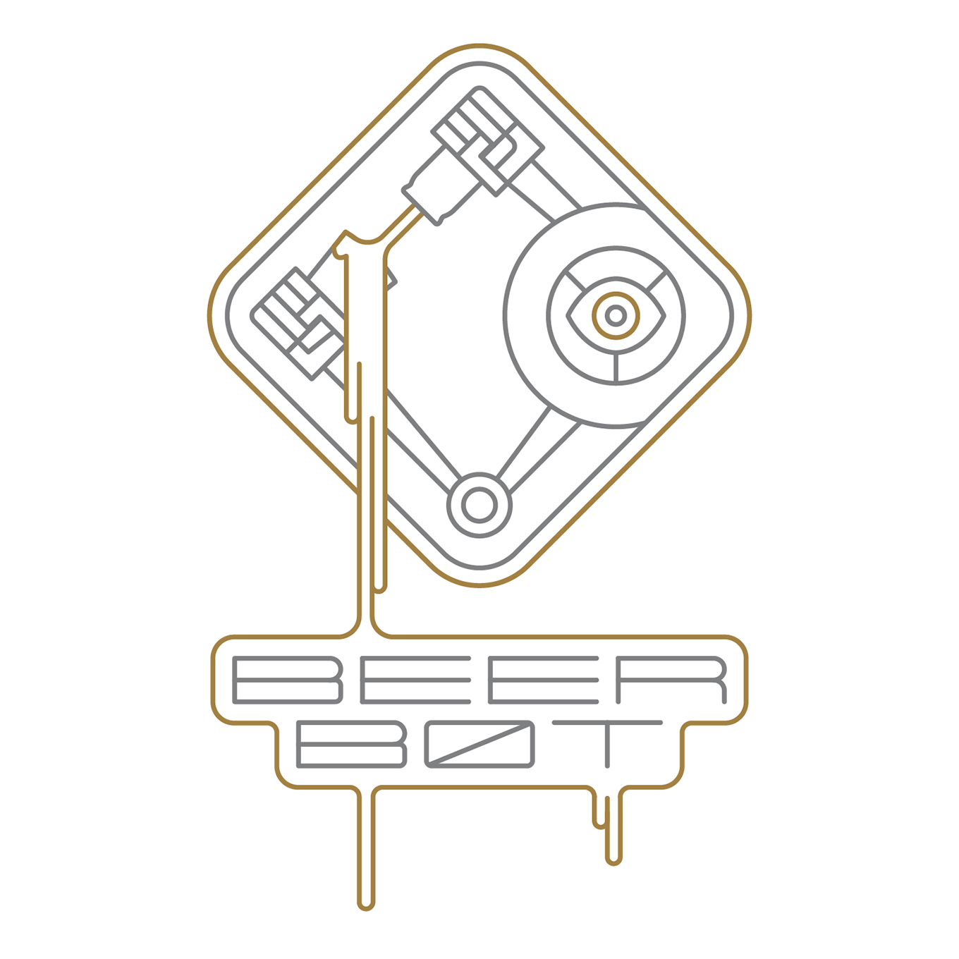
With slight tweaks, it works well on coasters too. I could definitely see these as stickers as well.
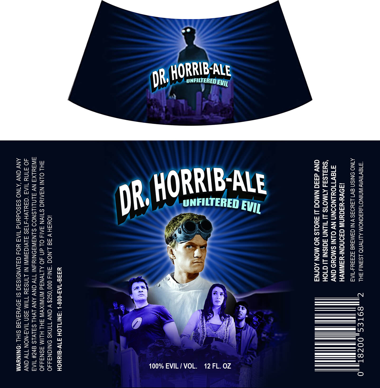
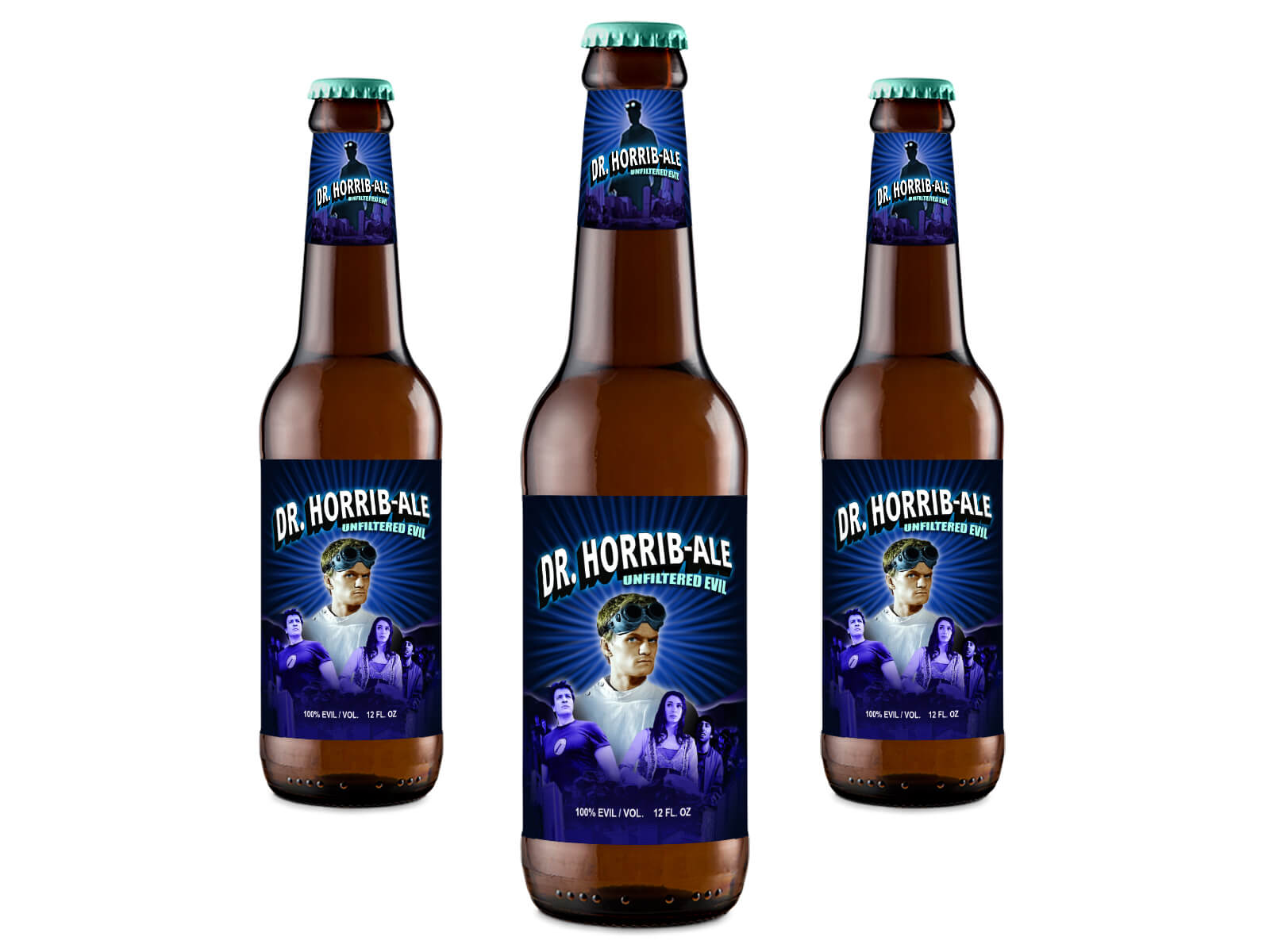
Dr. Horrib-Ale Mockups
What better beverage to enjoy while perfecting my evil laugh. Like the man said, “If you’re gonna get into the Evil League of Evil, you have to have a memorable laugh. What, do you think Bad Horse didn’t work on his whinny? His terrible death-whinny?” Besides coming up with that awful(ly good) pun in the beer name, I also had fun writing all the copy on the label.
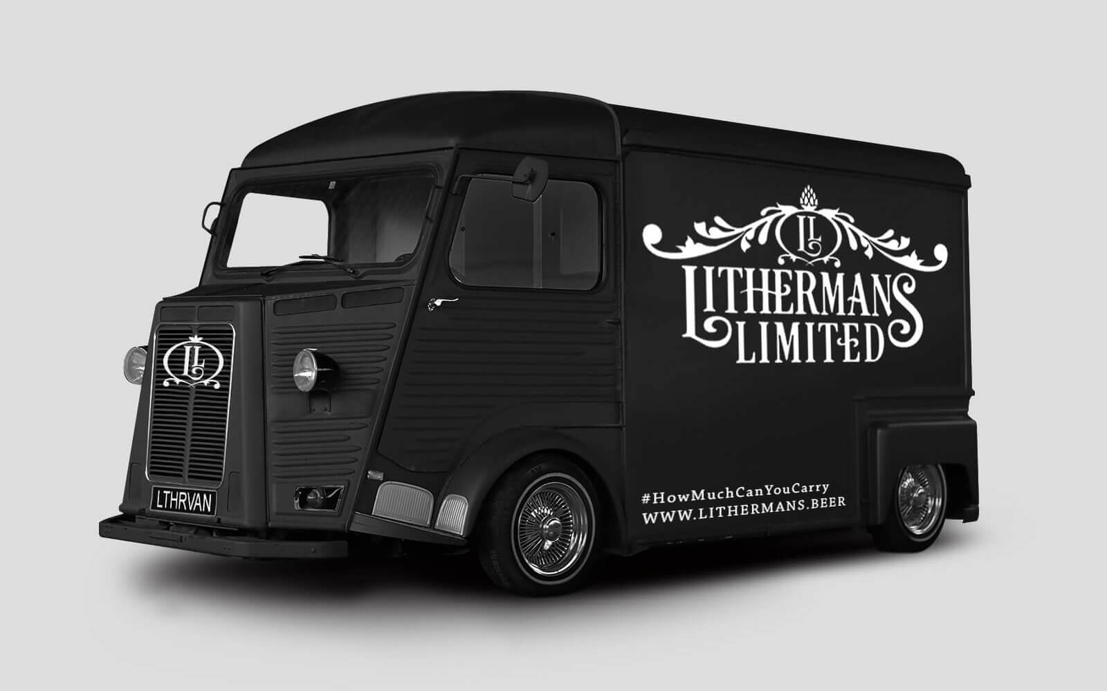
Lithermans Limited Delivery Van
I created this beast of a beverage bus (ok it’s actually a delivery van … and possible mobile taproom?) as a fun way to play with the brewery’s brand. Who knows, maybe we’ll see a fleet of these hurtling down the road delivering delicious beer to thirsty people in New England and beyond.
Red Rack Ale Label
A total redesign from the ground up, using minimal design and colors that work on dark or light containers with or without a traditional label behind them (can also be printed directly on bottles or cans). The red antlers (for the last 2 examples anyway) are also capital “R”s.
Ultimately the brewery went in a different direction and didn’t use these designs, but the exercise was a good one. More about that below.*


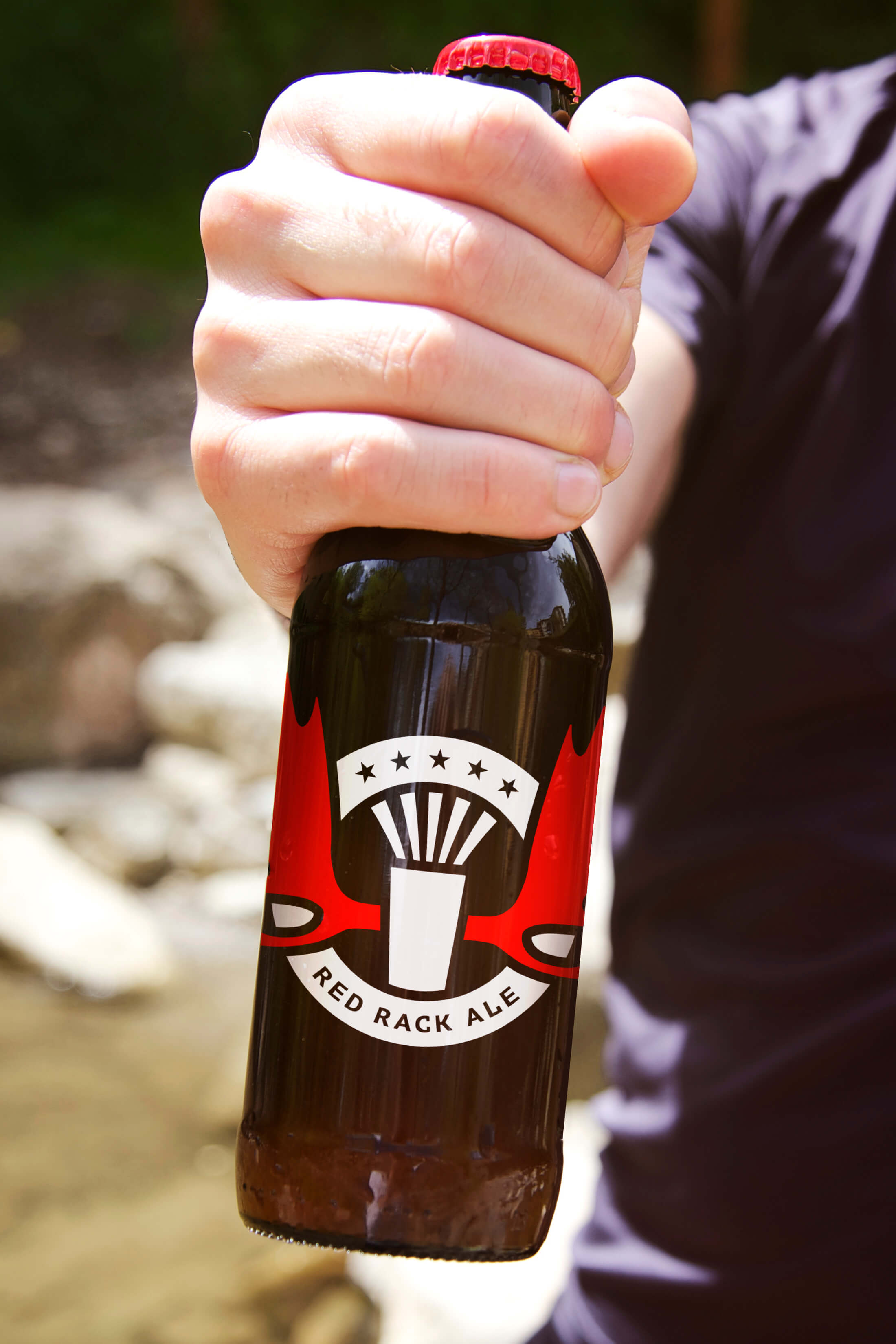
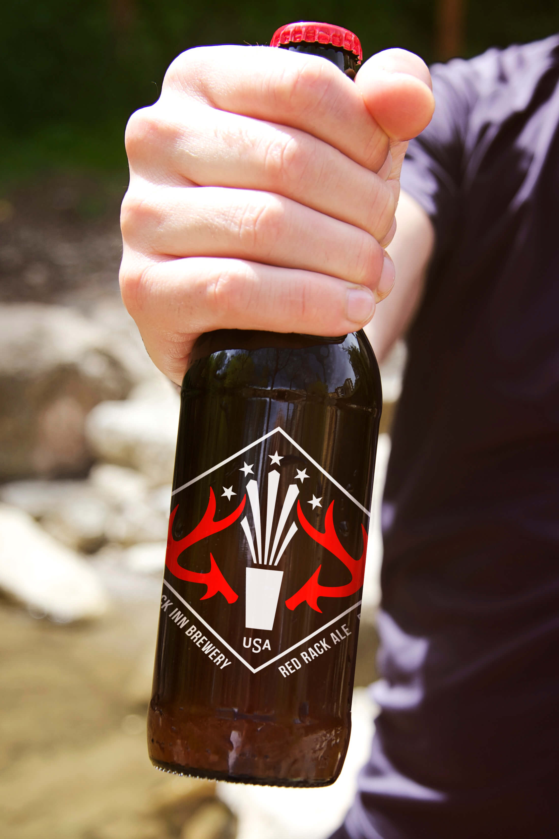
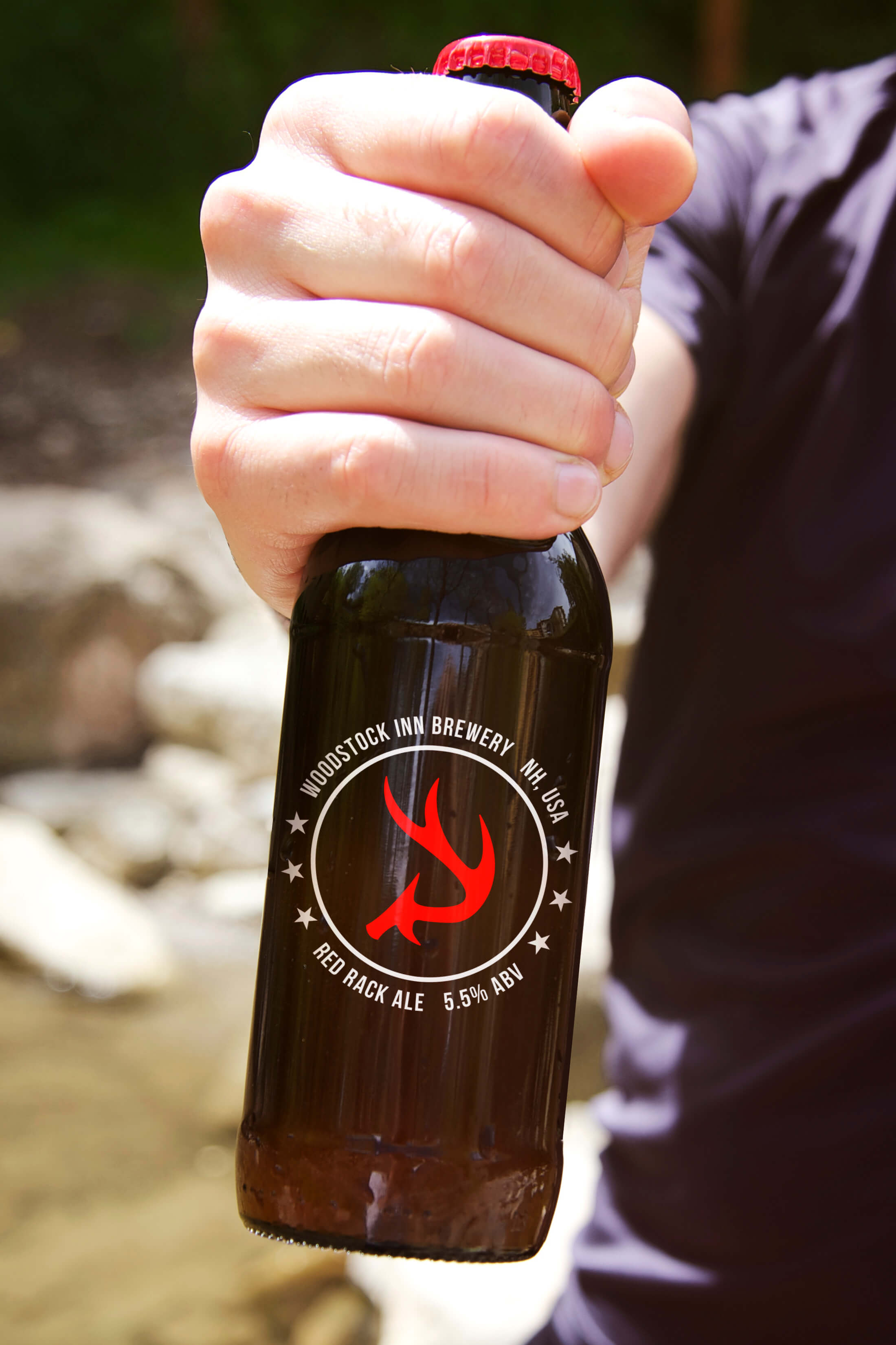
Did I mention this is a total redesign and would have been a completely new direction for the brewery? This would have really pushed the limits of not only their brand, but what’s generally expected from established beer branding. That’s what I attempted with this design – push limits, be memorable, stand out.
*Woodstock Inn Brewery had a call for entries for this redesign, and yes, although it could be considered spec work, I wanted to do it because designing anything beer-related is awesome! Like I said, they ended up going in a different direction (perhaps my ideas are a bit too far from their current branding).
At the end of the day this was a lot of fun, AND is a real-world(ish) solution with which to woo other breweries.
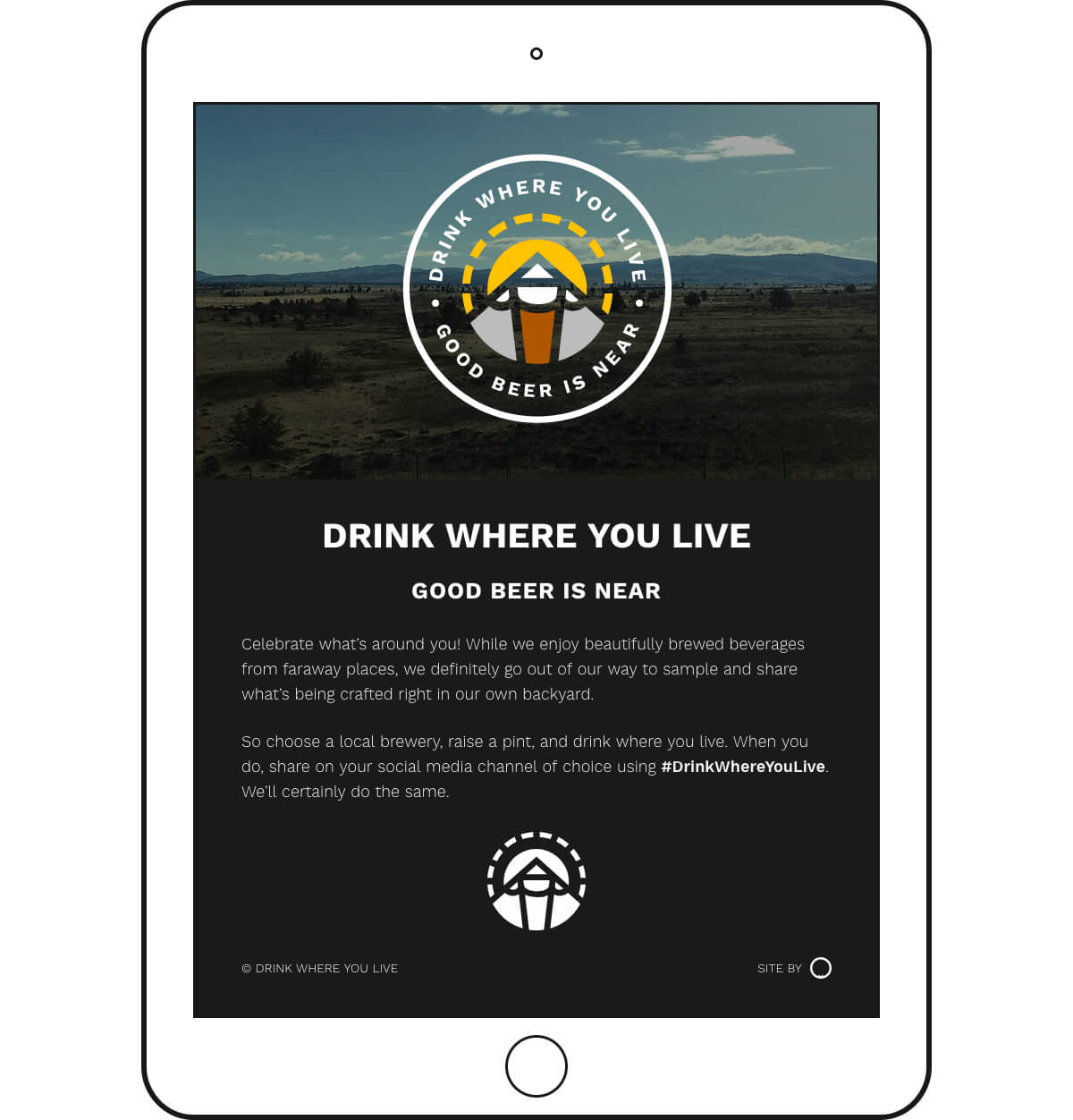
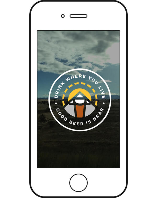
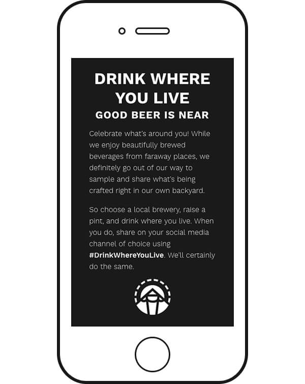
Drink Where You Live
Here’s a badge design that not only commemorates a memorable trip, but represents my love of sun, mountains and passion for finding and drinking great local beer.

For me, local is always better whether it’s food, friends, or beer. On a recent trip to Oregon, I was inspired not only by the beautiful scenery and overall friendliness of everyone I met, but also by the amazing beer I had a chance to sample – so I decided to create a badge to commemorate my time and that feeling. And it’s not limited to Oregon – I’m crazy about the breweries where I live too.


The lines are thick, like the blood and sweat Oregonian brewers pour into their brews (not literally, but you get the idea). The font is Nunito. I don’t usually use rounded fonts, but this one really fits here and gives the overall design a National Park Badge sort of feel.


I ended up using a tweaked version of the badge for the Drink Where You Live web page.
Good Beer Saves Lives
Drinking a quality-crafted (and hopefully local) beer can be a matter of life and death!
So buy your friends a round of the good stuff, lift your glasses high, and save others from bad beer!


Welcome to the bottom of the page. Like I mentioned up top, I’d love to do more of this type of work. So if you’re a brewery, or a lover of beer that needs some sweet swag or other marketing materials designed, let’s talk.